
Upcycled children’s book
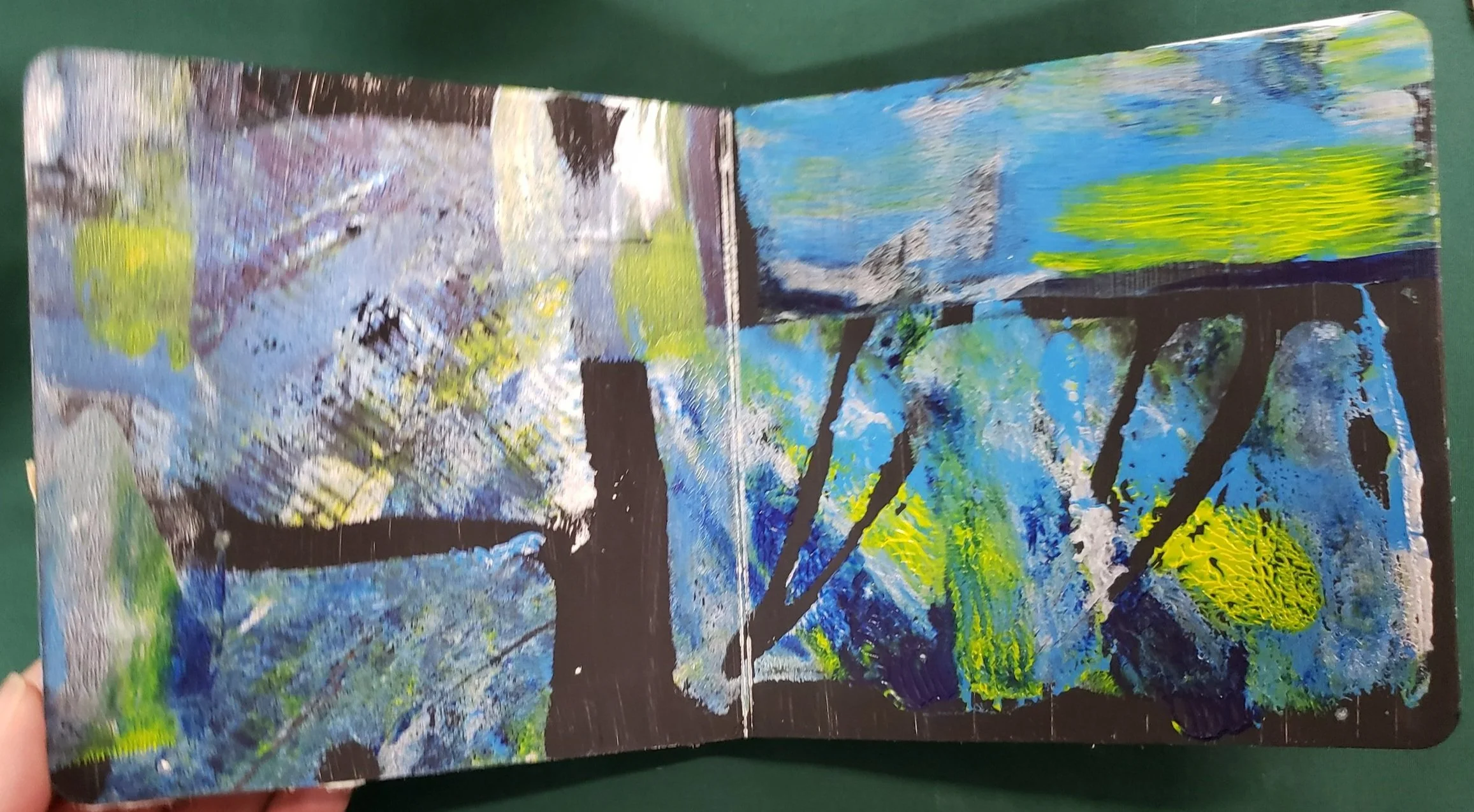
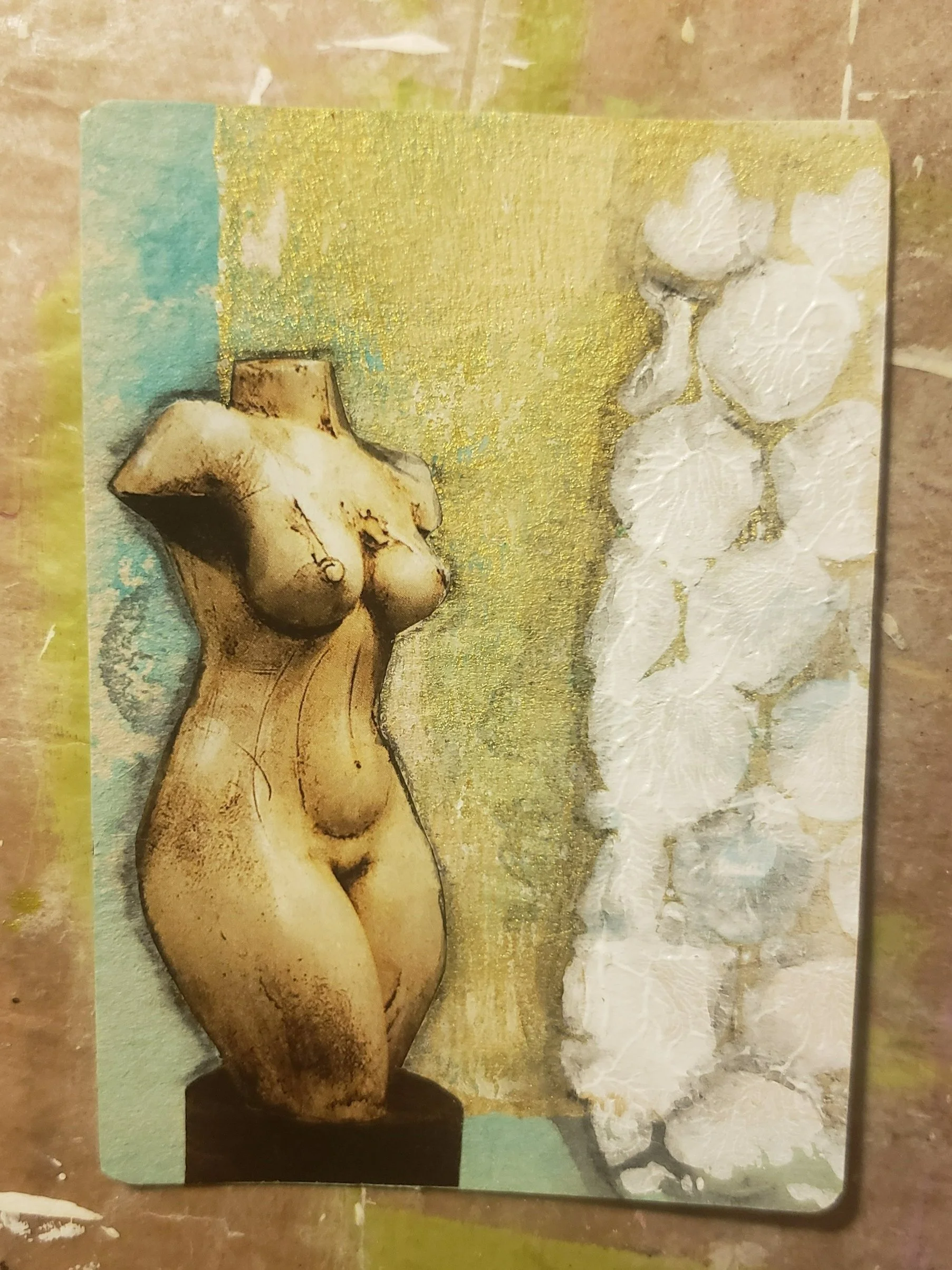
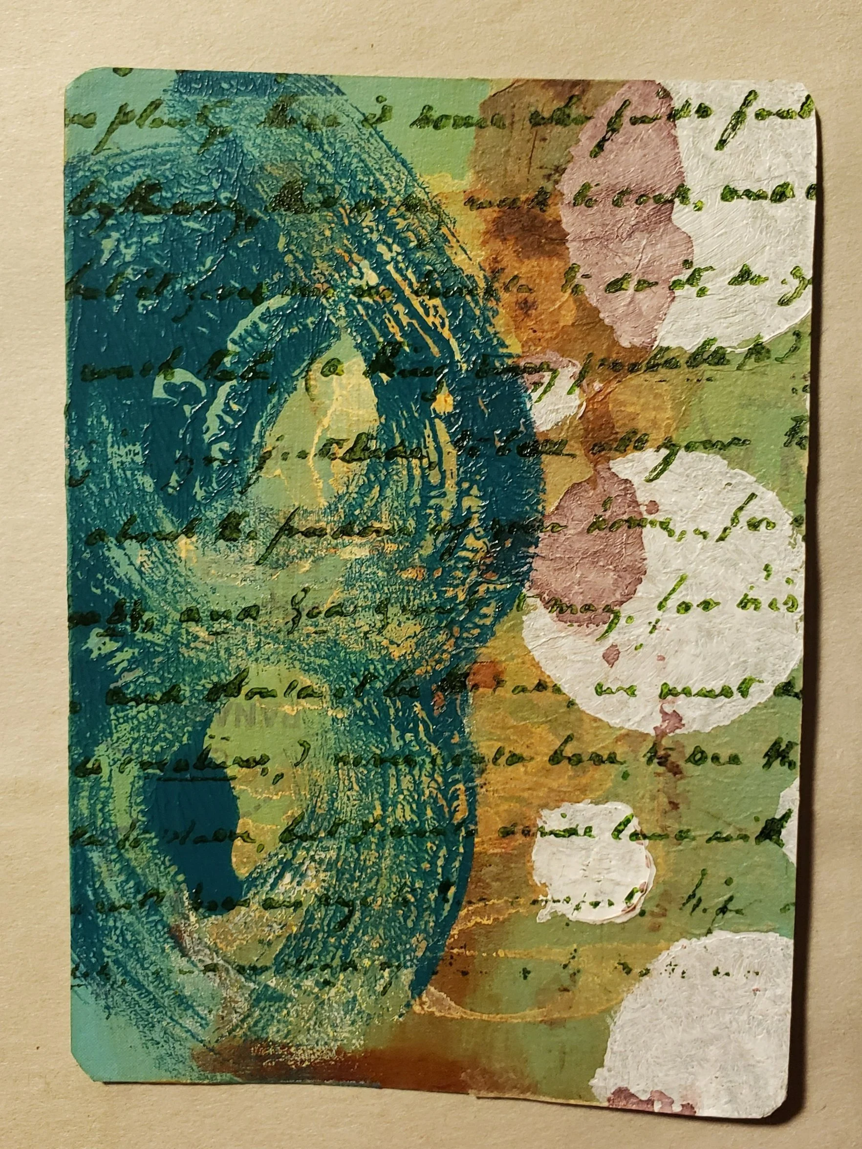
Mixed media page in upcycled children’s board book
This week I’ve been working on improving a children’s board book. I’ve already altered most of the pages, but there are a few that some serious work.
This is one of those pages where I stared at it for quite a while, waiting for something magical to happen in my brain. Then I played a game (or two or five) on my phone.
Finally I started digging through my scrap bin for colors to either match or complement the original background.
The background was printed from a gelli plate and the image was particularly uneven because the plate was handmade by the instructor of a mixed media class. Which is pretty cool, but I’ll admit to using store bought gelli plates myself. I do have the recipe for a homemade gelli plate somewhere…
Anyway. I found some scraps of green which seemed to match, so I glued them down. So far, so good.

Then, my muse or inspiration or whatever, took a cigarette break. Didn’t come back.
So, I went to bed. Laying in bed, I thought and thought. And decided some stamped text in a light color would tie the background to the abstract green shapes. Turns out my lightest color ink is platinum. Platinum it is!
It’s either a curse or a blessing, but I have BAGS of images that I’ve cut out over the years. So I dug through a bag. Then a few more. Finally I found the peaches and some statues. I decided I really liked the peaches, probably since it’s a complementary color to the blue/green. My husband decided the statue was required and I think it works because it’s a neutral color.

I added some highlights with a white gelly roll pen and my ever-present black Stabilo All. Then…the right side looked empty. I needed a quote. A good quote. Right away I thought of Ozymandias, but that struck me as pretentious. And depressing. And although I love my Christina Rossetti, I couldn’t find a relevant section in The Goblin Market. Then I remembered TS Eliot’s Love Song of J Alfred Prufrock. Something about trousers, peaches and mermaids.
ASIDE: if you haven’t already, you should check out the YT audio clip of Eliot reading this poem. It’s fantastic.
I wrote the poem on a transparency in white Posca pen on the front, and created some shadows with a black Sharpie, working from the back. I freely admit - I got lucky on that the text fit on the first try. I had drawn in a rough outline of the page as a baseline and then just went for it. Finally, I trimmed it to the page and glued it down with matte medium, which dries clear.
And that’s it. That’s the page. This is my ideal project - it combines imagery and one of my favorite poems. Not to mention how much better it looks than just the original background.


Yet another 365 update
365 challenge update using playing cards
It’s been a whole six weeks or something since my last post about my 365 Challenge for 2022. In case you’re new here, a 365 challenge (or the way I’m doing it) is to have 365 pieces of art by the end of the calendar year.
In my case, I’m using some of the eight million decks of playing cards I’ve collected and using the backs as a canvas. I’m on my third deck of cards and accumulating a nice little stack. I typically sit down at my art table and work in stages - first I cover the back of the card with a background paper pulled from my stacks of ephemera and scraps. Then once or twice a week I’ll do several cards at a time, working with a stack of focal points or just layering scraps until it looks finished.
To get focal points, this week I dug through some Smithsonian magazines, tearing out images I liked. I also went through my collection of greeting cards sent as a “thank you” from charities. “Fussy” cut the images out, try them out against the various backgrounds already glued to the playing cards, and glue them down. Finally I add in some shading, usually with a Stabilo All black pencil, which is water soluble. Or I use a Gelly pen or Posca marker for highlights.
Sometimes they wind up looking pretty similar. But that’s ok, because over time I’m building a tiny library of color schemes and images using different media and art supplies. Any that I like can be replicated or expanded or developed into larger pieces. Someday, when I actually do that, I’ll post it here. You’ll see it first!
In the meantime, here are some recent pieces I made.


art challenge: inktober
Inktober art chllenge

Because I’ve been doing this whole art thing (I really wanted to put quotes around the word art) for a while, it may seem like I have an endless amount of art to show on this blog. To which I say….maybe?
I think I’ve mentioned before how I don’t feel like I’m dedicated to a single media or art style. I really like to experiment with different styles and media and constantly look for new projects and ideas. Even shortcuts, on occasion.
While I’ve posted plenty of photos and descriptions of current 365 challenge (I’m nearly a week behind, but who’s counting), I thought now is a good time to describe a different challenge.
Inktober is a popular annual challenge (not without controversy) that involves ink and, wait for it - the month of October. Every year this challenge seems to check all my boxes - it’s short, it involves a minimal amount of art supplies and can be tailored any way I want. I’m in.
Now, I will not say this is an easy challenge. I have now tried it at least three times and only completed it once.
But I want to share the once!!
I started by drawing a frame on some 5 X 7 papers and figured I’d fill them in, free hand drawing with ink. No outlining, no advance drawing, no complicated shading and no following the suggested prompts.
By day 3 I was running out of ideas and already getting desperate. Somehow I came across this gelly print I did earlier where I’d used a fashion magazine.

I decided to draw, freehand, this single face onto more 5 X 7 inch papers. Short, sweet, sort of easy. I mostly used Kuretake black ink 60, which I received one of my monthly Sketchbox subscriptions. It’s a great ink - super black and permanent and it can be watered down for shading.
After a while I tried to get fancy and add some shadow to emphasize the shape of the face.
You know, a few wound up looking they had black eyes, but whatever. I did it. I made 31 ink drawings.
I was amazed at how different each face turned out. Really amazed. Then I was amazed at how they looked when I put them all together.
How is it possible that every face could look so different when they were all based on a single source?
I can’t explain it. I mean, I’m sure someone with a degree in art can tell me why….eyelids, angles, line width.
In the meantime, I just enjoy looking at the different faces.

Negative painting - fish in space
Using a book on space to create an altered art, mixed media world where fish fly through space.
One of my first blog posts was about negative painting - November 2021 - which seems SO long ago!!
In that post, I used a magazine page. Essentially, you “paint out” the background of an image, keeping only the parts you want. Then you can add anything you like back in - glue images, paint in features, and use colored pencil, paint pens or anything else you can imagine to create a new world.
It’s both easier and harder than it sounds, with decisions to make every step of the way. What I find easiest is painting out the background first, not thinking too hard about it, then coming up with a “theme” to re-create the page.
Fish. I love using them. I feel like they add instant dimension. I use images from thrifted books on aquarium fish and free nature calendars. My favorite (although harder to find) are the books that don’t use glossy paper. But there are plenty of other themes you can use, depending on what’s available. Books focusing on cooking, flowers, animals (dinosaurs are another favorite of mine), the circus, travel, space, etc., can all be used to create a whole new world out of an old one.
In this case, I started with a hardcover book on space.

Here you can see the texture of the text through the paint. I left a “planet” as part of my original concept.
First, paint out the text and any other parts of the images you want. Where there are pictures of textured landscapes or other feature photos, I often leave a circle so that it looks like a moon or planet.
Next, I start “trialing” images to see where I want them to go. In this case, I decided I’d have an Aquarium In Space. These particular fish came from a nature calendar and I flipped through images of aquariums for inspiration and ideas. I also have a thrifted book on watches. I like to use the frames around the faces to create “gates” or portals in many altered art scenes. You can get these kind of images from any fashion magazine.

I wound up not liking the “planet” so covered it up and added some mountains to create a middle ground.
Once I had the layout I wanted, I glued down the fish, watch frame, pagoda, space rocks and mountains. Then I painted in the plants and added more bubbles.
Described like that, it seems pretty easy. And sometimes it is - when I can see the finished product in my head early in the process. Other times, it takes a lot of moving images around, digging through my piles of magazines and other sources of pictures, etc.

There are an endless number of small details that can make the image look “finished.” Highlights and shadows, for example, add depth to an image and can be added with many different kinds of art supplies.
What’s nice is that if you change your mind, you can usually paint over any mistakes or images you decide you don’t want.
TBH, I would say I like the final product about 85% of the time…there have been a few duds. Like, real bad ones. But usually it comes out better than you think it will!

obsessed with mushrooms
Abstract mushrooms in my sketchbook and 365 art challenge
Sometimes I’ll draw or make something, then become a LITTLE obsessed with making more. I know, you’re thinking, “Corina, you, become obsessed? What? No!”
Uh huh. Like one-eyed monsters. Or animals named Bob. Or 5 second faces. I’m sure it’s totally normal.
Well, this time it’s mushrooms. I’m finishing up a free sketchbook revival class from Carla Sonheim’s website and was captivated by a class by Tiffany Sharpe (she can be found here: Handmade Books - Tiffany Simply Sharpe) where we had a discussion about collage fodder and then made mushrooms to use as focal points.
Some background terms and definitions if you’re new:
Collage fodder is basically just a collection of stuff you can use in collage. Usually it includes tissue, book pages, painted papers, napkins and gelly prints, but also includes anything you can glue down. Bits of metal, beads, wood, old art, tags, broken cd’s, etc.
And a totally off-the-cuff definition of a focal point: the place in your art where the viewer’s eye is drawn and rests. Basically, the single point of focus in your art piece.
Tiffany led us on the process of making several very loose, quick mushrooms to glue onto a background. I loved the way my sketchbook mushroom page turned out, so decided to incorporate them into my 365 challenge as well.
Mushrooms are really two basic shapes - the domed top and a stem. In real life, mushrooms come in an endless array of shapes, textures, colors and sizes. So you can go crazy with ideas for the ‘shrooms themselves OR with ideas for the background. And it’s ok, you can make fun of my snail/bunny (I’m calling it a snunny).
Tell me what you think! I’ve listed the supplies I used after the photos.


I used papers with painted, gelly printed or ink text backgrounds, watercolors, black alcohol marker, stenciled tissue paper, white gelly pen, black stabilo All and a white Posca pen.

Coloring Books - More ways to “art”
Using coloring books to practice highlighting, shading and other art techniques while just having fun. Kerby Rosanes is my favorite coloring book artist right now and DeDe Willingham taught me this technique through her YT videos.
Art, like everything, is all about practice, practice, practice (Marsha, Marsha, MARSHA!). Replacing mental filter now...
I am not the kind of artist who loves one medium to the exclusion of everything else. If I was forced to label myself, I guess I’d be a mixed media artist. But I don’t love any single art supply, paper or medium to the exclusion of others. My only rule so far is that everything should be non-toxic, since I usually wind up with art supplies in my hair, on my arms and even in my mouth. Don’t ask.
So when I see YT-ers promoting low-cost and low-risk ways to experiment and practice using different materials, I’m usually all in. One of my earliest discoveries on YT was DeDe Willingham, who streams a live chat show on Monday and Wednesdays. She has been an artist and/or had artistic jobs her whole life and I appreciate her casual and chatty approach. I also admire her ability to multi-task live for 3 hours while simultaneously doing a whole variety of art. I have learned a whole lot from her…so, Thanks Dede!
While there are many coloring book artists out there on YT, I basically use DeDe’s approach, using Kerby Rosanes’ coloring books, which I buy from discount online bookstores and the thrift store. The books are so fantastical and fun and a treat for the eyes. Essentially, Dede’s technique is to use washes of matte paint as an initial layer, shade with colored pencils, then highlight with paint pens. You can browse her videos to hear her explain everything in greater detail and watch her actually do it. She provides all kinds of tips, suggestions and recommendations.
If you’ve never tried coloring with colored pencils, the main issue is that wax builds up quickly, making it harder to shade. But using a paint wash serves as a middle “tone” or color, so you can use fewer colored pencils, specifically for shading and highlighting.
My shading skills definitely need improvement (I should probably find a class for that somewhere) but I really appreciate how easy this is for a beginner to try. I’ve only completed a handful of pages - they do take some time. But you can always put them aside and come back to them later; they don’t have to be finished in one sitting.
I’ll admit, I think this process makes me feel like I’m a sophisticated artist.


365 Challenge update
365 Challenge, art cards, mixed media, self-taught artist, junk journals, upcycling
It’s time for more 365s….
I haven’t done this challenge in a few years. So in some ways this feels new but also feels like it is STILL such a challenge.
I’ve tried to keep my rules few and loose…but I often feel like I’m just repeating myself. The same materials, the same stamps, paint, themes, etc.
But that’s how this works, right? You keep working every day and eventually you break through that wall. You develop your style, figure out your favorite color palette, your favorite materials and what works for you.
Keep in mind, I’m not doing a card a day. I usually work in groups when I feel inspired - I’ll do 6 or so backgrounds at the same time or use up extra paint to create a background when I’m working on something else. When I feel like I have the time and mental space, I’ll sit down and “finish” 3-7 cards at a time, using scraps and leftover materials from other projects.
I will admit, obviously, to being partial to adding poetry to my pieces. It doesn’t even matter if other people recognize the poems I include as text, all that matters to me is that I know it’s there…..


Creating backgrounds using poems
Create a background for use in mixed media projects, including junk journals, postcards, collages and other art.
There are probably an infinite number of ways to create backgrounds or pieces for use in your art, especially if you’re into mixed media.
One of my favorite ways to create a background combines my love of poetry and art. I love finding a use for my favorite poems, incorporating them into my art, and writing them down. For some reason, I could write and re-write my favorite poems on paper over and over, probably for hours. This way I can write them down, use them and then have an actual excuse to do it all over.
I first start with a piece of paper, usually a colored one. Construction paper is fine or any lightweight paper.

Tan paper with Raw Sienna matte acrylic paint brushed on.
I might make marks on it with acrylic ink, maybe thinned with water. Any kind of mark making is good - using a brush, letting the stain spread naturally, drips, spritz the paper, etc.
Once dry, I completely cover the page in matte acrylic paint, thinned down with just a tiny bit of water. (I use DecoArt Americana from Michaels.) The goal is to spread a light layer that dries quickly and will show your brush marks and any original marks underneath. I find earth tones work particularly well with this technique - raw sienna, ochre, etc.
Finally, I use a dip pen and ink to write out a poem (you can also use a favorite book quote, song lyrics, etc.) Any permanent ink will work. I like to use a low contrast ink (e.g., earth colors on earth colors, dark blue on blue paint) which seem more flexible to me when it comes to actually using it in your mixed media piece. Acrylic, sumi, and manga ink or permanent / alcohol markers will all work.
TANGENT ALERT: Lately my favorite poem to use is “Goblin Market” by Christina Rossetti. It’s a great story with fantastic imagery. This poem is even more enjoyable after reading the novel Hide Me Among the Graves by Tim Powers. In it, he imagines the entire Rossetti family is haunted by a vampire, with Goblin Market written as a warning to others of the dangers of accepting a vampire into your life. Some other poems I like to use are The Love Song of J. Alfred Prufrock by T.S. Eliot, and just about anything by ee cummings. For me, I love feeling the images and phrases roll around in my head as I physically write the poems down. And because I use a dip pen and ink, I can take my time, use old style cursive and really think about the phrases and images.
I know, you’re thinking we started with a mixed media technique and we wound up talking about vampires. That’s just the way my brain works. You just see how I write my personal book reviews.
Vampires aside…. sometimes instead of writing a poem, I’ve filled the page with freehand images, usually with acrylic ink.
Once everything is dry, you now have a piece of paper that already contains 2-4 layers of marks, media and textures. You can tear the pages up to use in pieces, cover a postcard with it as a background, glue is to a canvas or anything else you can imagine. Because they will be torn and covered up, you don’t have to be too precise or “precious” in creating them. In fact, imperfections make them shine all the more.
Below you can see the different stages of this process and the way I used it to alter a playing card for my 365 Challenge. I also like how the edges of the torn paper show up as a contrast against the paint color.


365 challenge update


Here are some recent 365 Art Challenge pieces. I really like how some of these are turning out. They’re also a good way to use up some scraps and stray pieces.
Of course, I’m behind, but the goal is to have 365 pieces at the end of the year, not do one every day. I’ll catch up. Eventually.

experimenting with markers
Early drawing experiments using artist grade markers.
I wasn’t always the amazing artist whose work is found on every t-shirt, coffee mug and tote bag.
OK. Maybe my art isn’t everywhere, although I have been tempted to have it printed on a coffee mug at Target. In fact, the only place you can find my art right now is the first two Saturdays of every month at the Women’s Cooperative Farmer’s Market in Bethesda, MD.
But I did have a beginning to my current art journey. And it started with markers. Well, before that I was a quilter but that’s a whole other story.
Markers were my first “grown up,” expensive art supply. Before that I mostly worked with glitter glue, rubber stamps and a heat gun. Not that there’s anything wrong with that.
I think the key was getting an art room of my own. Not the closet, the bedroom or the living room. But an actual art room where I could shut the door and have some space to think.
Not having taken an art class since 8th grade, I started off with a basic set of markers from Blick (not even brush tips, gasp!) and a black Sharpie. And then I drew a curved line across a piece of paper. Then I drew over it. Again. And again, widening it in some places, keeping it narrow in others, adding bumps and loops and arcs when I felt like it. When I was done, I started coloring it in with my expensive markers.
Now, of course, I know that these were basic artist markers, not the coveted alcohol markers that I still don’t know how to use…but I did ok with what I had. And it travelled well. It’s relatively easy to add a bag with a dozen markers, a few sharpies and a notepad into your carry-on. I didn’t even use marker paper (didn’t know that existed yet), just regular old Canson mixed media paper.
I kept most of the pages and I like flipping through them every so often. I’m surprised at how far I’ve come but also surprised at how willing I was to try my markers in different ways, without consulting a book or even the internet.
And they still look pretty cool!


Personal Art Challenge for 2022
I decided that 2022 was the year to challenge myself to another 365 Art Challenge. With a capital C. Trying, as always, to keep it simple, I decided to use playing cards as the base format. Other than that, I am free to choose any art style and medium, subject or theme.
Sounds simple but I had several ulterior motives. First, I could finally upcycle all the decks of playing cards I’ve accumulated over the years. Second, it’s a small format so they can be finished quickly. Finally, and possibly most importantly, I’m hoping they serve to provide inspiration for future art projects. I’m also hoping at the end I can punch holes in the corners and put them on a metal ring so I’ll have them all conveniently located in one place. OK, maybe I’ll need a few rings….
This is my chance to experiment with color themes, styles and of course art supplies.
I started by gessoing about 6 playing cards and then choosing a bright and cheery color combo to fight back against the January blahs. Then started using stamps and hand painting on scraps, tissue paper and gelli print papers. I’m liking the first set of results.


Quote books using upcycled children’s board books
This will be my first in a series for this category – over time, I’ve discovered children’s board books can be used in a variety of ways.
In case you’re unfamiliar with a board book, I’m referring to those first books for toddlers where the “pages” are composed of thick cardboard.
I buy mine from the thrift store – a bag of the smallest size books usually costs about $2 and larger books may be individually priced with the normal children’s books. You can probably find more from other local sources (or in your own house) but I find the thrift store the most convenient.
Using board books can take a few extra supplies and some planning. You will need:
Fine sandpaper
Crafting primer (i.e., gesso)
First: Unless the books are VERY well used, it’s best to lightly remove the shiny top layer of each page and the covers with a piece of sandpaper. The goal is not to remove the entire background design, just rough the page up a little.
Next: Lightly cover each page in a crafting primer, usually called gesso. Gesso is typically white but can be found in other colors, including red, gray and black. Don’t worry too much about getting into the spine/crack of the book. Let dry.

Board book after sanding and gesso
Your book is now ready to take just about any craft supply you can think to use. Since the pages are primed, you can try out markers, watercolors, paint, colored pencil, wax crayon, etc. You can use rub-ons, stickers, stencils, and stamped images. You can also glue paper, photos and other images onto the pages, but be aware your book may not “close” all the way, which is completely fine.
In this first version, I kept the images on the left and lines from the first stanza of an e e cummings poem on the right. I used markers for the images and the text.


(I’m pretty proud of this Bob Ross-inspired page – I did it while watching one of his TV shows, following his directions to create the “perspective”. I did it to prove that it’s NOT easy…and I was wrong. It just takes courage to try.)
In the second version, I experimented with a variety of art supplies – I tried to list them as a reference for each photo.


Your quote book can reference a favorite poem, family member, famous personality, musical lyric or a line from a book.

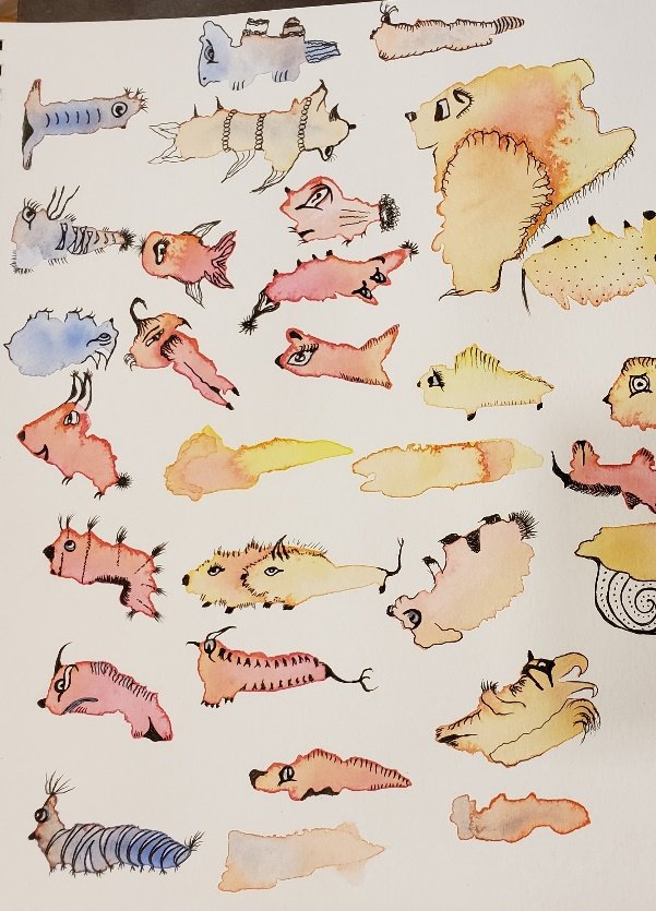
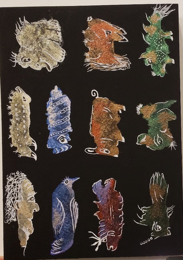
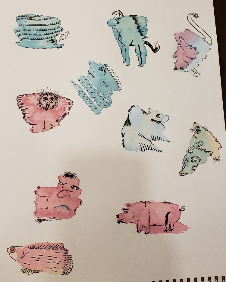
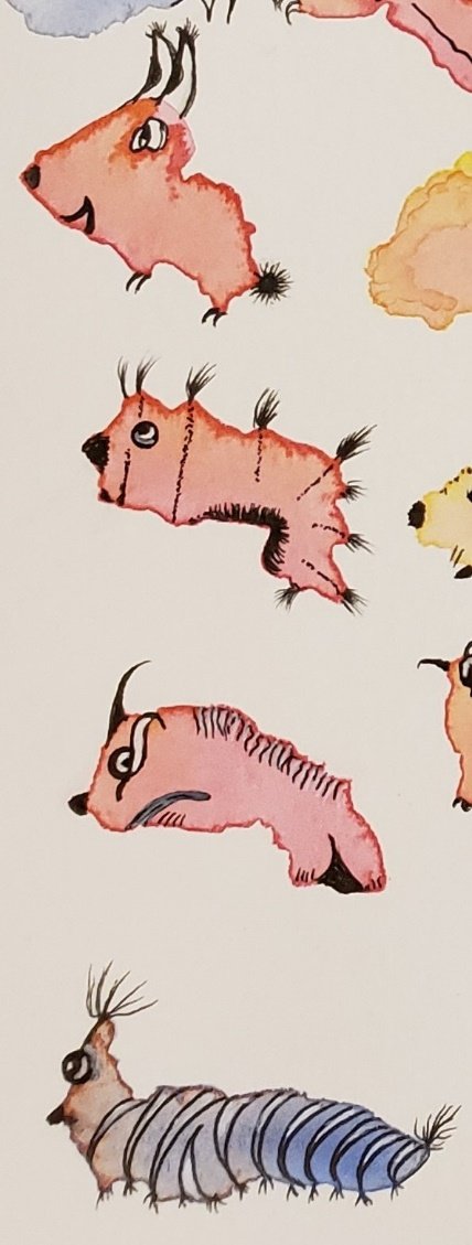
“Blobimals”
art exercise watercolors mixed media
Sometimes I think I like art exercises more than producing actual “art”.
I found Carla Sonheim’s book, Drawing Lab for Mixed Media, and now have all of her books (and taken a few classes…..but I digress).
As usual, I latched onto an exercise and then Could Not Stop. My excuse is that it’s a good way to learn how to use your art supplies.
Essentially, you lay down a blob or two of color and then turn it into a fantastical creature. I encourage you to check out her website/books for more specific instructions.
My Blobimals were painted with Finetech mica watercolors on both black card stock and watercolor paper and Windsor & Newton and Gansai Tambi watercolors on cold press watercolor paper. I used a variety of markers and pens, including a white gel pen, for the details.
The joy of doing this is there is no wrong or ugly Blobimal. It’s a low pressure experiment because the original background blobs were easy to make. So there’s not a huge time investment.
But be prepared for some Blobimals to speak to you more than others.
There are a few that I will bet money have pretty interesting backstories….


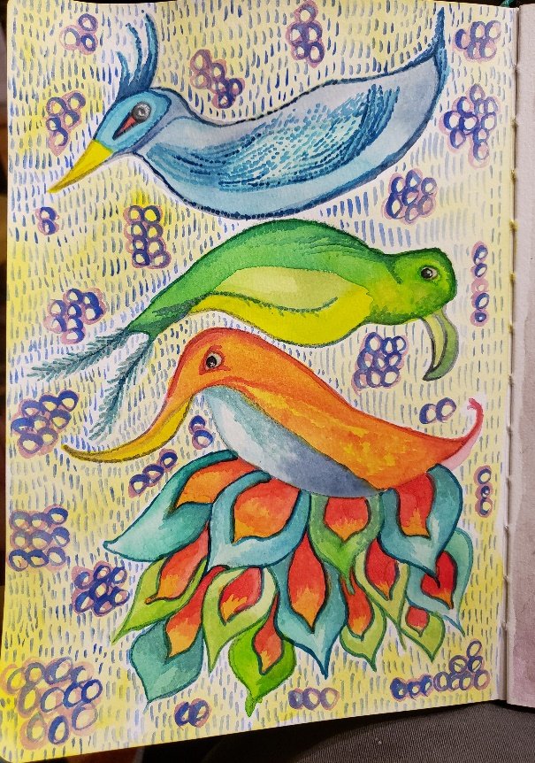
annoyed birds….?
Another day, another attempt at an exercise from one of my books. This time, thought I’d try some birds. IRL, birds come in every shape and color so you can’t really go wrong…

first layer with a really soft pencil
When experimenting like this, I usually start with a really soft pencil that I hold between my thumb and forefinger at the back end. This helps me feel “looser”. Which in this case, is a good thing.

Speaking of loose, I have no idea what the birds are sitting on. None. Tree? Bush? Nest? Viewer’s choice.
I tried some watercolor washes, then when it was dry went over the top with one of my favorites – Caran D’Ache Neo Color II, with a water brush, brushing it right on the crayon.
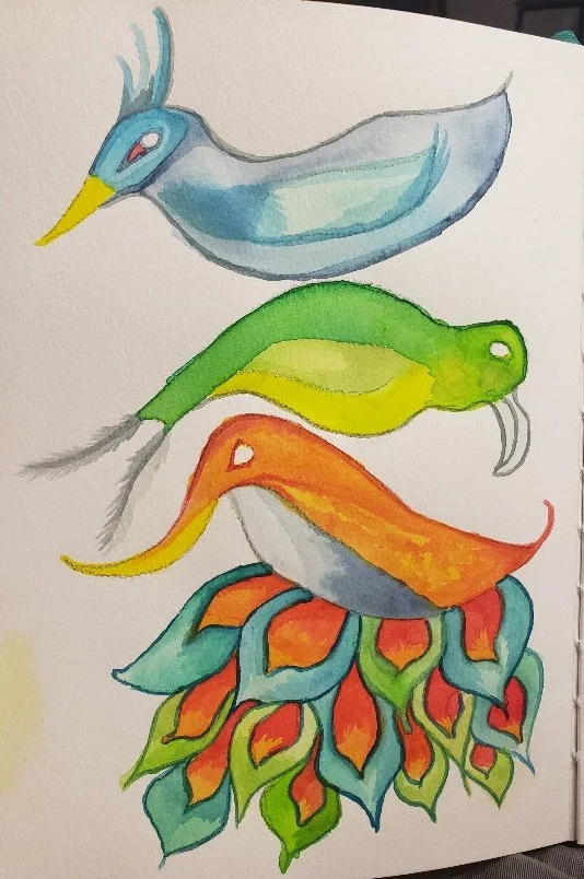
I like how the Neo Colors layer and you can keep building them up. I did a lot of stippling with the water brush.
I typically wait until I’m about halfway through before giving them pupils – at which point it’s amazing how much personality they acquire!
The only problem is when they wind up looking annoyed. Like mine so often do.
There are some people who can layer and layer and layer endlessly. I am not one of those people.
But this time I forced myself to keep adding, trying for some depth and additional detail. I even made myself wallpaper the background.

annoyed birds taking shape
What I can’t figure out tho, is how the birds ended up levitating instead of resting on each other.


Handmade Stencils
Living in the DC metro area, I try to take advantage of the museums, classes and other art-related stuff near me. During a mixed media class, the teacher invited us to use some of her handmade stencils, cut from overhead transparency pages.

Handmade stencil traced onto overhead transparency.
Cool idea, right? But….overhead transparencies? Where on earth would I get those?
Lo and behold, I found not one, but two full boxes of overhead transparency sheets at local thrift stores. Who says making sacrifices to the Thrift Gods is a waste of time?!
Using magazines as a source and a permanent marker, I traced a variety of images - from buildings to birds - then decided to try cutting out the simplest one with a craft knife. Harder. Than. It. Looks.
If you decide to try this and are not an expert with a craft knife or tiny scissors, definitely start with a large, basic image without a lot of small details. (I have yet to find the courage to start cutting out the feathered bird….)
Cursing over, I had to decide what to actually do with it.
I decided to flip through my mixed-media notebooks. Since I dislike wasting any art materials, I usually have some pages where I’ve smeared leftover paint or other media for just this kind of project. I “auditioned” the template against several different pages before picking one. In this case, I traced the image, then flipped it over and traced it again, trying to create a “corner” of the building and some dimension.
After a lot more auditioning of papers and random material on my desk, I added gelli-printed papers to emphasize the sight lines – have I mentioned that creating depth is a challenge for me?
Then I used colored pencils to try and add more depth (self-taught artist, here) by giving the arches shadows, creating a roof, “cracks” in the walls, etc. With moderate success, I’d say. Obviously, that corner nearest the viewer is hardly structurally sound, but whatever.
As an experiment, it was fun. And a way to use up paper scraps. It will never be “finished,” but I’m just happy I figured out a way to re-purpose these leftover-paint-pages and gelli-prints, plus keep hundreds of transparency sheets out of the landfill for a while longer.

Mixed media collage using handmade stencil twice - once forward and again in reverse.

One Eyed Monsters
Sometimes, when I’m not feeling particularly creative (which is often), I will flip through my favorite instructional art books and decide to try an exercise. I happened upon one titled “One Eyed Monsters” which seems pretty self-explanatory.
Sometimes I struggle with art exercises. This exercise, for some reason, completely captured my imagination. Maybe because a monster can look like anything, so there were no “rules” to follow. Every medium became fair game. And any type of paper. “Disco Bob” is on mixed media paper using a set of watercolor pencils I received from an art box sub. The other creature was created using a Japanese brush pen on mixed media paper.
Once I started, I couldn’t stop. I drew one eyed monsters at work meetings, on junk mail, while at the airport and visiting with my nieces, using every kind of sketchbook and type of media I own. Everywhere. All. The. Time.
In the following photos, I used everything from gel pens to alcohol markers to metallic and watercolor brush pens, adding a collage item here or there.
Basically, this was proof to me that art exercises are like trying out new vegetables – you might be reluctant at first, but they’re definitely good for you and you might even learn to enjoy them.


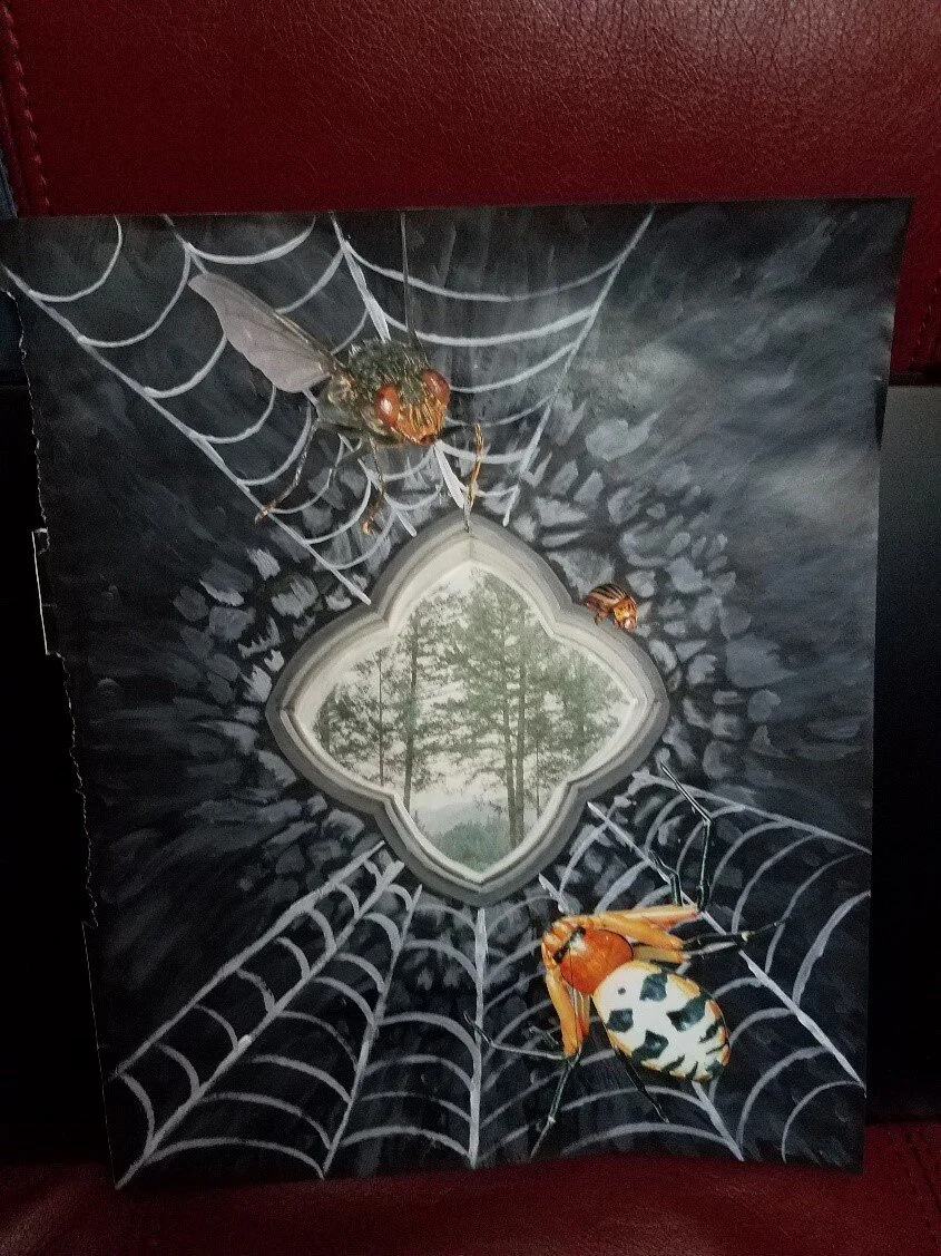
Negative Painting
One of my favorite YouTubers introduced me to the concept of “negative painting.” The idea is to paint something OUT of your chosen page (whether from a book, magazine, etc.) and then put IN whatever you need to create your own little world. YouTubers make it all look so easy, right?
Since this was my very first attempt, I thought I’d go low stress and use a magazine page. If I didn’t like the end result, I could just throw it away and no one would have to know, right?
This page started as an ad – the only original items left are the “window” and the trees in the middle. My idea was to redo the rest of the page so the viewer actually felt “underground,” looking out. For me, the best way to create an underground feel was….insects and spider webs. Sort of an Indiana Jones/Lord of the Rings feel.
I started with a deep breath. I love experimenting but it’s also a little stressful. I have to remind myself it’s an experiment, it doesn’t matter how it looks in the end, it’s all about the journey, learning about the materials, etc., etc., etc.
I finished up my internal pep talk with an internal high five. Then took black paint and painted over everything starting from the edges and working my way in, leaving only 3-4 layers of stones around the “window”.
Using grey and white paint and a small paint brush, I added several layers of concrete around the original window. Always searching for ways to add depth and dimension. More medium grey to paint over the small stones, even adding a few. After watching the paint dry (just kidding, I have a heat tool), I used a lighter grey to create some highlights on the stones closest to the light source. (Reminds self not to make the “stones” too symmetrical.)
Spider webs not being part of the very short list of things I know how to draw, I had to consult The Internet. I really wonder who their algorithms think I am. I drew a few practice spider webs on some scratch paper, then just went for it with more (lighter) grey paint and a paintbrush.
(I’m the boss of my art….I’m the boss of my art.)
Finally, I flipped through a book on insects that I keep as source material for collage.
I wanted large insects to make the viewer feel like they were close to the wall (and maybe imply the insects were extra big and creepy). Then at least one smaller insect to give the big guys perspective. Plus, to balance the image, I wanted the insects to not be facing the same way.
The end result was…interesting. Not bad for a first try. It was quick enough that I finished in an hour or so. It more or less reflected my original “plan” and I felt like I learned enough to make improvements on my next attempt.

upcycled children’s room decorations

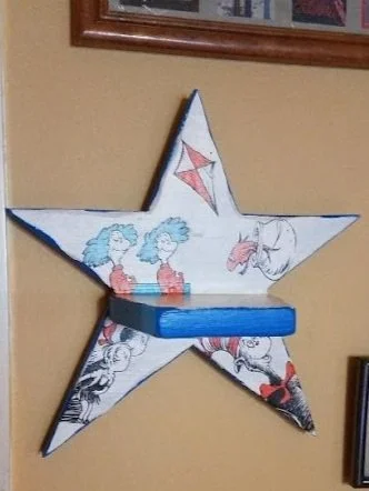
The beginning - wooden stars in “country Ugh” colors
I was coordinating donations for a craft table as part of a charity drive at work, recruiting as many volunteers as possible to submit an item or two to for the event. First of all, let me say that people are surprisingly creative. At work we often see only someone’s business side, and I REALLY enjoy learning that someone I’ve known for years knits or paints or sculpts in their free time. Plus it gives me non-work things to talk about with people at work (did I say that out loud?).
I was wandering through the “wood” aisle at my local thrift store when I came across this set of wooden star wall hangings. (Pardon the picture, I took these before I knew I’d be using them in a blog entry and would be showing everyone my dirty kitchen counter.)

A star for Harold….
I had to try to upcycle them somehow. I hated the colors, but they were small and cheap at $.99 each. Once I got them home, of course, I was thinking…Now what? So I brought one into work and involved all my coworkers in an upcycling “brainstorming” session. After throwing around a lot of ideas, “we” decided I should turn them into children’s decorations, each themed around a single book character.
So this is what I did:
Back to the thrift store to find children’s books. Final choices: Harold and the Purple Crayon, The Cat in the Hat and Curious George.
Sanded the stars down to get most of the paint and random gook off.
Primered them with gesso.
Cut out a bunch of images from the books.
Decided on a color for the edges, coordinated with each book’s color theme.
Actually doing the work turned out to be relatively easy, although time consuming. First, I mixed my own acrylic paint colors for the trim. It wasn’t super difficult, but it did take a while to get JUST the right yellow, green and blue. I never realized how distinctive those colors are, nor how strongly they’re tied to each author’s book character!
I also spent some time trialing the images on the stars to create a visually pleasing arrangement, with some characters facing up, some down, left, right, etc. In Harold’s case, I also practiced some stylized drawings to add to his themed star.
Once I had all the images arranged, I glued them with matte medium, let them dry, and hand drew the markings on Harold’s star. I also painted the back of the stars a basic black.
Finally, I covered each star in matte medium to give it a more consistent look since acrylic paint tends toward glossy.
I was very pleased with the final results, which I sold as a set for $35. Once hung on a wall, they could be used to hold a small item like a photo frame, candle, memento, etc.
I really enjoyed the entire process, especially turning something dirty and ugly into something cute. I was so glad to see them match my original vision. In fact, they turned out better than I had hoped. Plus, they received a lot of compliments and it’s always nice to know that other people appreciate your effort.
That blue is so hard to mix….

All three stars upcycled. So. Much. Better!